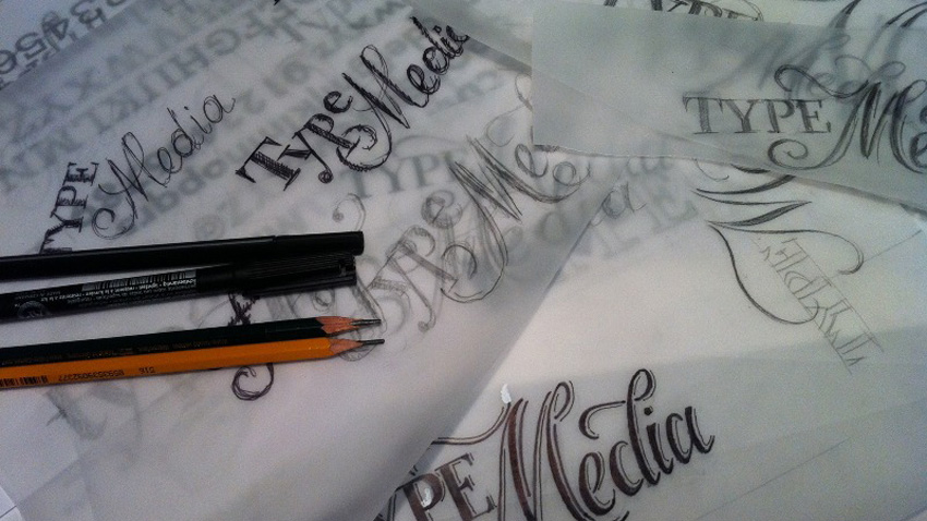
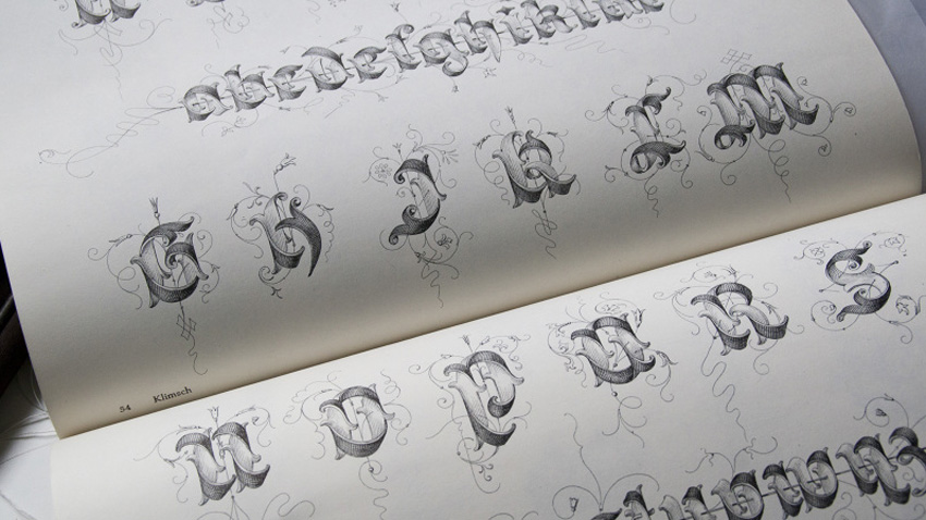
We rarely notice the letters that are all around us. Absorbed in our daily lives we seem to take them for granted. But what is it that makes a given text legible? Because there are times when reading can be difficult, however interesting the content might be. Herein lies the roles of typography and the visual effect it produces.
Krista Radoeva is a typography designer who lives and works in London. What is it that got her interested in typography? Krista Radoeva:
“It was more of a smooth transition. I loved drawing and art even as a little girl. But I was also interested in literature. I did classical studies at secondary school and that was when my eyes opened to different languages, alphabets and their history. But I was still lacking the visual part, so I decided to study graphic design in London and there my projects started leaning more and more towards typography. So, as time went by, I realized this was the profession for me and went to Holland to specialize typeface design. Typeface design is something that enables me to combine all of my interests – drawing, different alphabets and the study of their history.”

Krista recently put the finishing touches to a font based on the work of French 16th century typographer Simon de Colines who made the fonts for the books he himself printed. “I took his work as the basis for what I was doing. History plays an important role in design but if we want a given font to be a success we have to keep in mind the contemporary context,” says Krista and adds:
“Each different font affects the way information is perceived. There are many studies showing that though most people aren’t aware of it, it affects the subconscious. For example, if you use a typeface that is unsuitable, the most trustworthy information will seem dubious. And vice versa, if we use a font that looks reliable, then the written text will carry much more weight.”
The designer mostly works solo, but she often discusses details and exchanges tips with her co-workers from the Fontsmith typography boutique.
In May Krista conducted a workshop “Better lettering”, part of Typfest 2016 held in Sofia and Plovdiv. There, together with her colleague Maria Doreuli, they introduced the participants to the basics of lettering. But what does lettering actually mean?
“Lettering is a specific combination of letters, an inscription of sorts that serves a specific purpose,” Krista explains. “People often mix it up with fonts, but with lettering you may have a word with repeating letters and each of the letters may look different, whereas with fonts, the letters are always the same because they are used in a system. Lettering is something in-between calligraphy and typography design. Together with Maria we use it because we think it will help students learn more about the construction of letters. Lettering is all around us all the time – on book covers, posters, T-shirts…”

A font called FS Siena was recently completed with Krista’s help. The idea to create it belongs to the man who founded Fontsmith, Jason Smith, who sketched the first letters when he was still at university. He wanted to create an elegant typeface inspired by the proportions of Roman letters but he wanted them to look modern. When Krista joined Fontsmith he handed her all of his work. In the first months they discussed all details but the final touches were left to her. And as she was engaged in a host of other projects it took her about a year to complete FS Siena.
In September Krista will be coming to Sofia to hold a calligraphy and typeface workshop on how to write letters applying the traditional calligraphic method and how calligraphic shapes become typeface. “It is great to have events like this in Bulgaria and often – it is a good thing to see more and more people interested in typography because fonts are an important part of our lives every day,” says Krista Radoeva in conclusion.
English version: Milena Daynova
The Bulgarian minority in Romania marked a significant event with the official opening of the Bulgarian Inn in the village of Izvoarele (Hanul Bilgarilor), Teleorman County (Southern Romania)- a locality with Bulgarian roots dating back over 200 years...
The 14th edition of DiVino.Taste, Bulgaria’s leading forum for wines and winemakers, will take place from 28 to 30 November at the Inter Expo Centre in Sofia. Over 80 producers from all wine regions will participate, offering tastings of around 600 of the..
Minutes before the second and final reading, at the parliamentary budget and finance committee, of the state budget for 2026, the leader of the biggest party represented in parliament GERB Boyko Borissov halted the procedure and sent the draft bill..

+359 2 9336 661
